Building brands people remember.

Strategic branding, creative direction and campaigns for ambitious organisations and consumer brands.

Who We Are

Marcus Walters Studio is an independent branding studio helping organisations find clarity, create distinctive identities and build brands people connect with.

We combine strategy, design and illustration to create brands that work in the real world.

What We Do
Pink circular graphic with black and white text reading 'Brand Strategy & Naming: Finding clarity before creativity.'
A circular graphic with an orange background that says 'Identity Systems' at the top and 'Creating distinction through design' below, emphasizing branding and design principles.
Green circular badge with white text that reads: 'Campaign Development: Building attention and engagement.'
Blue circular graphic with white text that reads 'Rollout & Activation' and 'Launching brands with confidence'.

Selected Work

A food stand featuring a large banner that reads 'Voodoo Chicken & Fries.' Three men are working behind the stand, with the middle man smiling. The stand has menus and signs showing options for chicken, fries, and various sauces, and there are social media icons and contact information displayed.
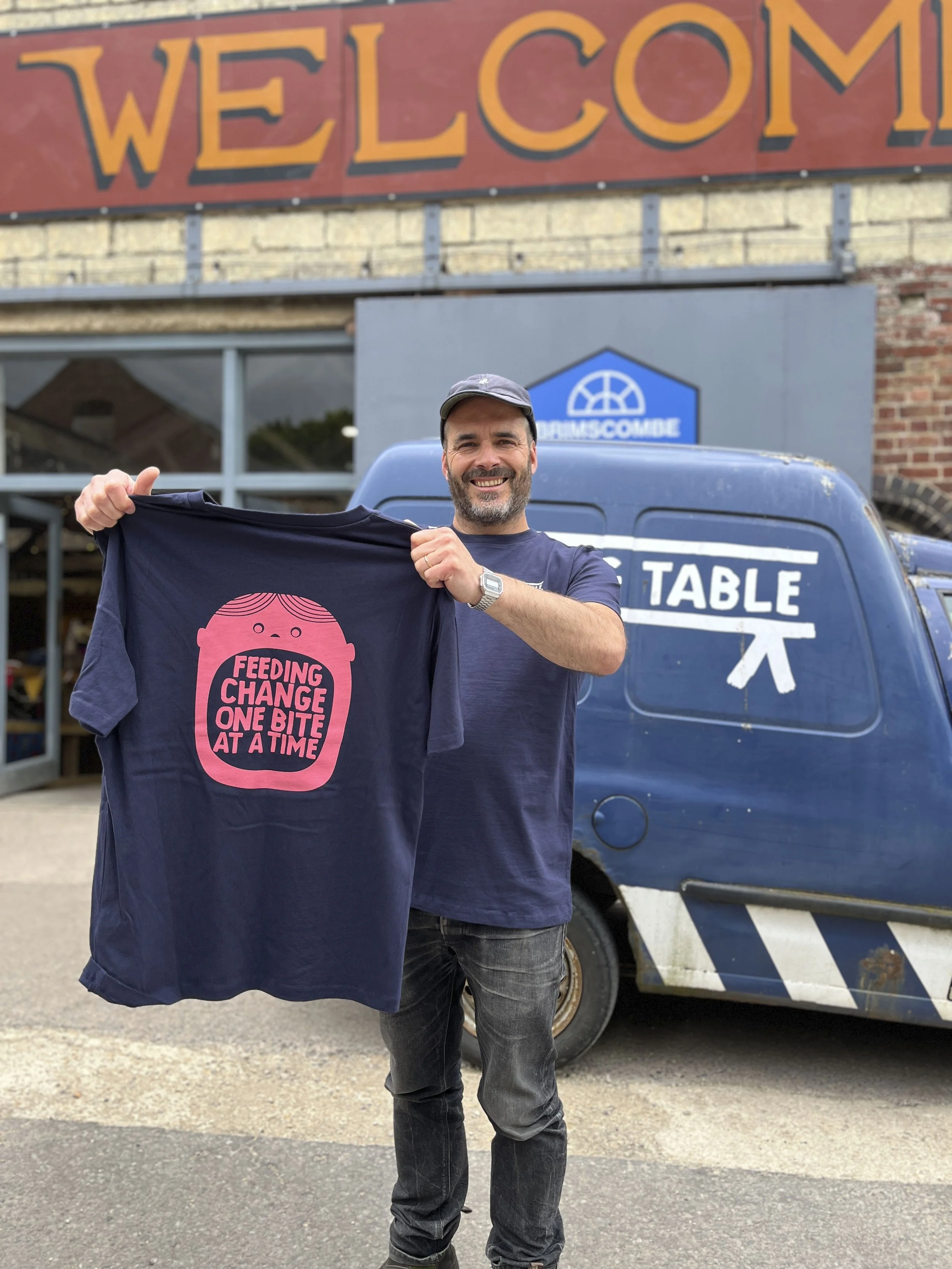
Man smiling and holding a dark blue t-shirt with a pink graphic of a baby's face and the text "FEEDING CHANGE ONE BITE AT A TIME". He is standing outside near a blue van with white graphics and text, with a brick building and large welcome sign in the background.

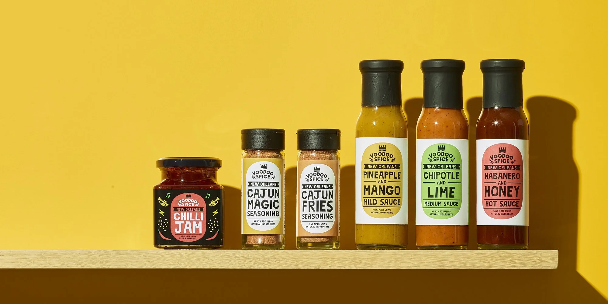
Voodoo Foods

Repositioning a growing street food business into a premium, scalable food brand.

The Long Table

Building a family of brands centred around food, community and social impact.
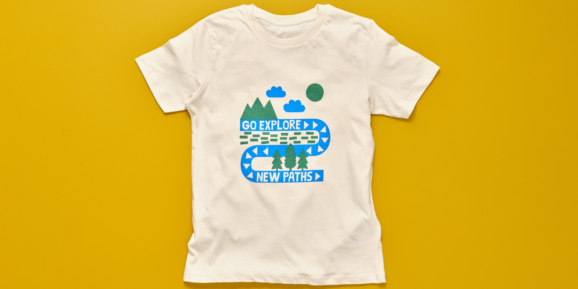
White T-shirt with a colorful forest adventure graphic and the text "GO EXPLORE NEW PATHS" against a yellow background.

Westmorland

Strengthening one of Britain's most distinctive hospitality brands through product, retail and storytelling.

Three jars of honey with labels reading Black Bee Honey, featuring colorful text for different flavors: Summer Honey in blue, London Honey in pink, and British Heather in purple.

Black Bee Honey

Creating a premium identity inspired by provenance, craft
and nature.
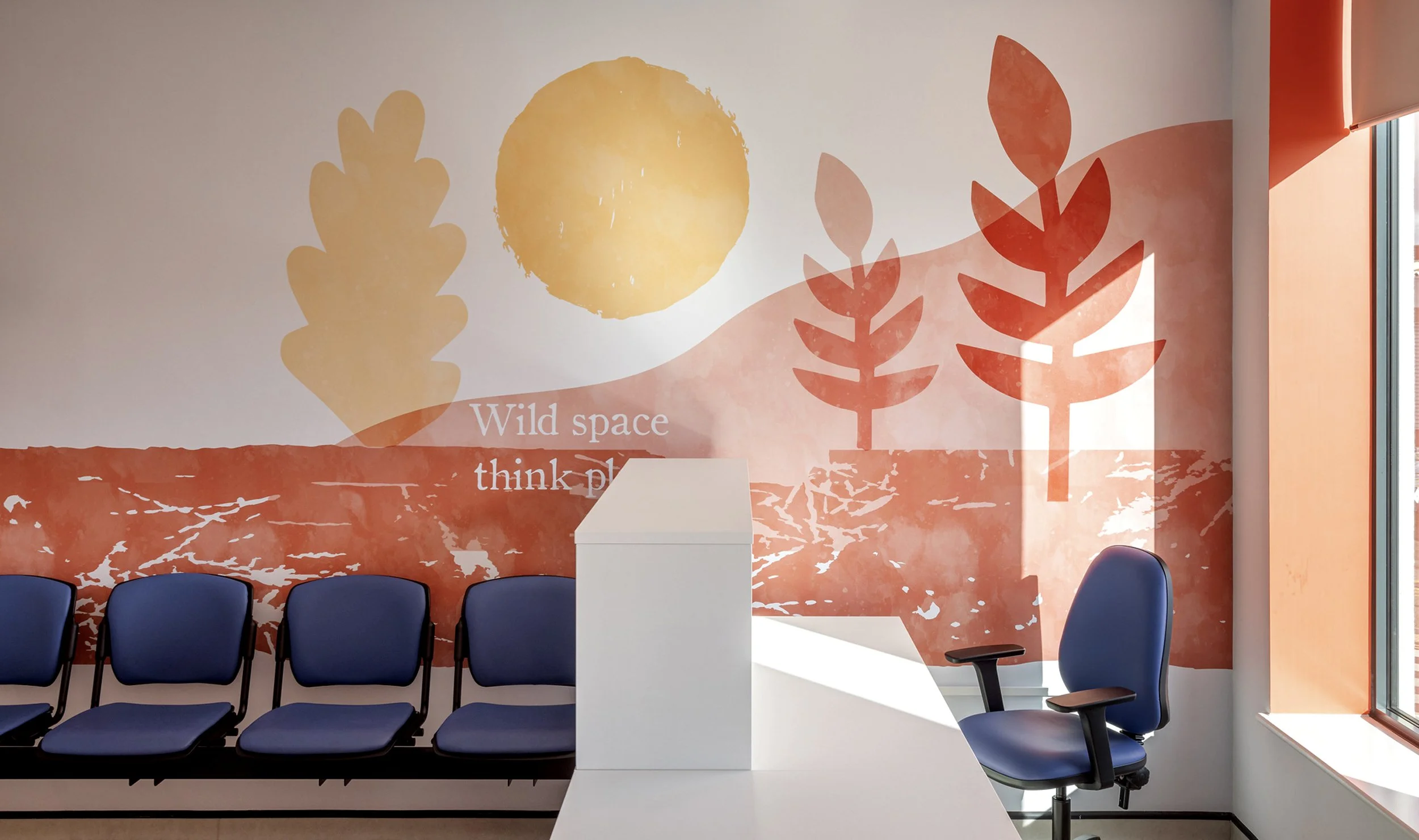
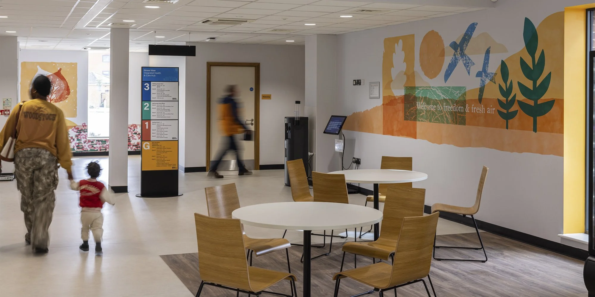
Interior of a waiting or conference room with a mural of large abstract leaves and a sun on the wall. Four chairs are in front of the mural, and a white desk or podium is in the center. The room has a window with sunlight and orange accents.

Grove View

Transforming a new healthcare hub through wayfinding, colour and visual storytelling.
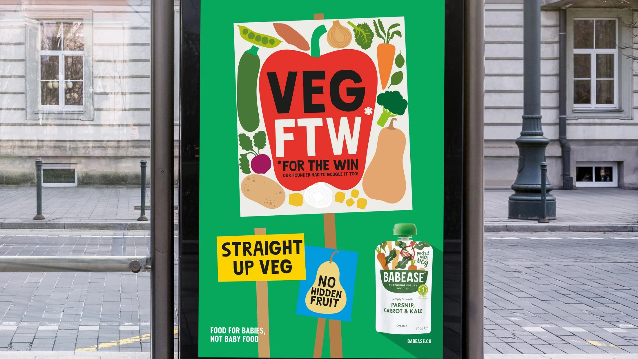
A colorful sign promoting vegetarian and vegan foods with illustrations of vegetables like a carrot, onion, broccoli, spinach, and peas. The sign features text such as 'Vegan for the Win,' 'Straight Up Veg,' and 'No Hidden Fruit.' It also advertises Babease organic baby food with a green logo and mentions it is suitable for babies, not baby food.

Babease

Helping a challenger food brand communicate with confidence and personality

Our Process

FORGE is our five step strategic framework for uncovering what makes an organisation distinctive and turning that insight into a brand people understand, trust and remember.
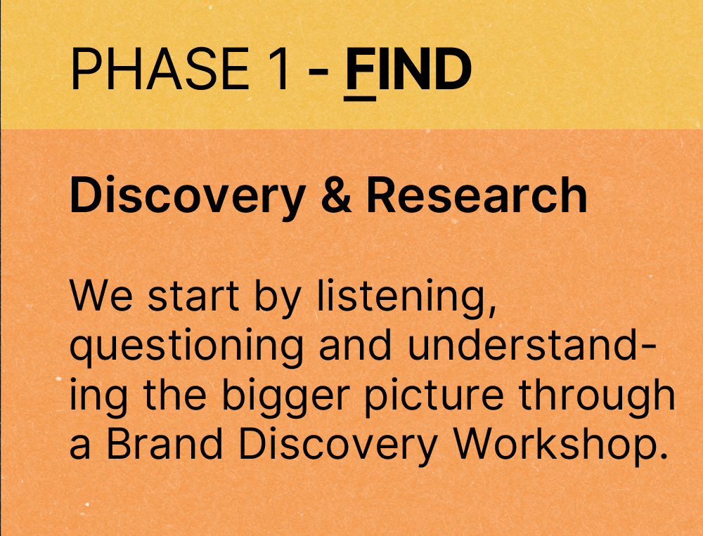
A slide with a yellow and orange background displaying the text: 'PHASE 1 - FIND' at the top, followed by 'Discovery & Research' in bold, and a paragraph explaining the process of listening, questioning, and understanding through a Brand Discovery Workshop.
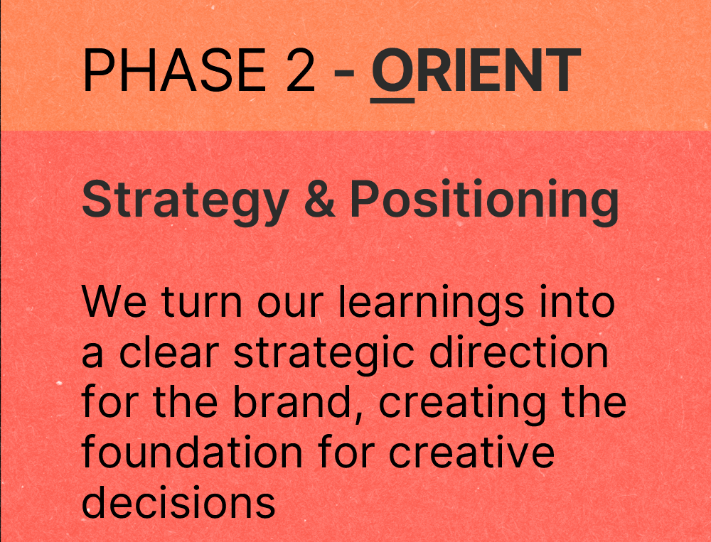
A presentation slide titled "Phase 2 - Orient" with the subtitle "Strategy & Positioning". The slide explains turning learnings into a clear strategic direction for a brand, creating a foundation for creative decisions.
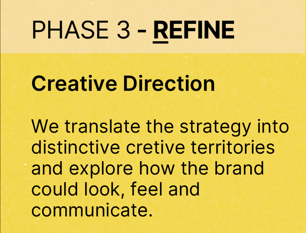
Sign with yellow background that reads, 'Phase 3 - REFINE' and 'Creative Direction: We translate the strategy into distinctive creative territories and explore how the brand could look, feel, and communicate.'
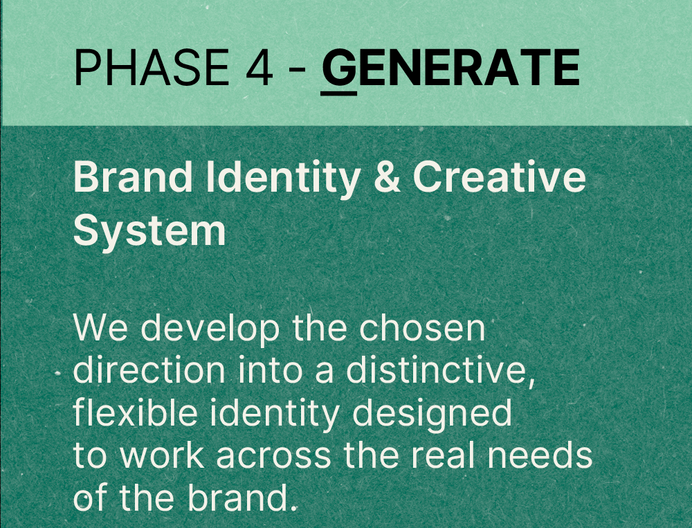
A poster with the title "PHASE 4 - GENERATE" in bold, black font, and the subtitle "Brand Identity & Creative System." The body text states, "We develop the chosen direction into a distinctive, flexible identity designed to work across the real needs of the brand." The background is a gradient of green shades.
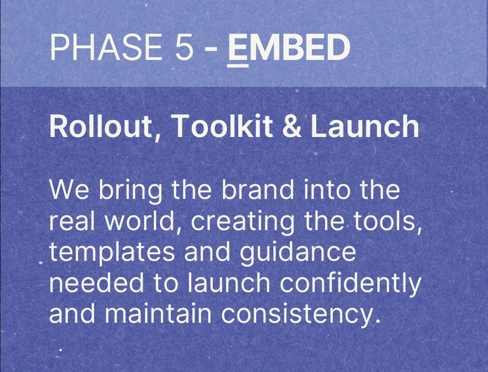
A sign or presentation slide with the title "PHASE 5 - EMBED" and the subtitle "Rollout, Toolkit & Launch." The text explains that they bring the brand into the real world, creating tools, templates, and guidance needed to confidently launch and maintain consistency.

Clients

Black and white logo of the word "Clarks" in cursive script with a small registered trademark symbol.
Logo of John Lee Wills & Partners, a legal or professional services firm.
Three black panels with white letters, spelling 'B', 'B', and 'C' in large font.
A cartoonish drawing of a smiling face with two eyes and a halo above its head. The word 'innocent' is written below the face.
V&A logo in black serif font on a white background
Black background with a pattern of evenly spaced white dots forming a distorted shape.
A simple line drawing of a child's face with a tear, representing health concerns, next to text that says 'Great Ormond Street Hospital Charity'.
Levi's Vintage Clothing logo in white text on a black background.

Brands come to life through every interaction.
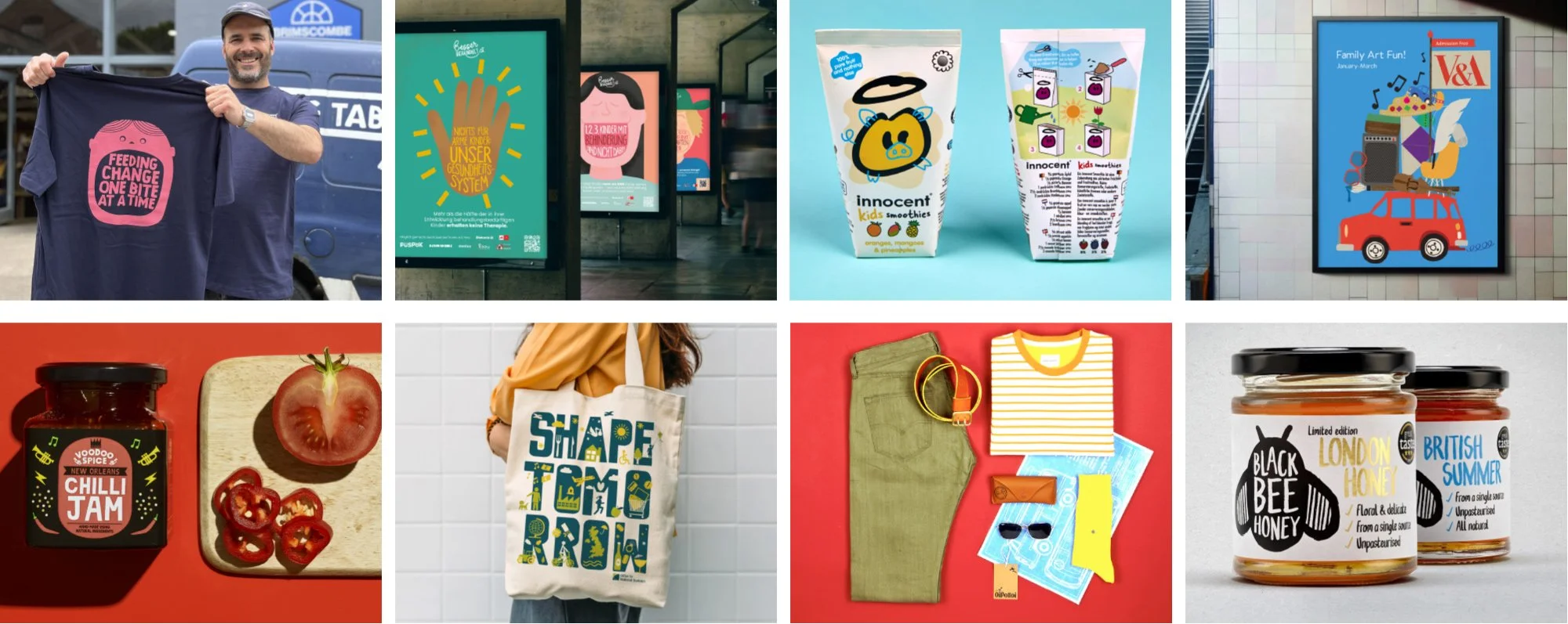
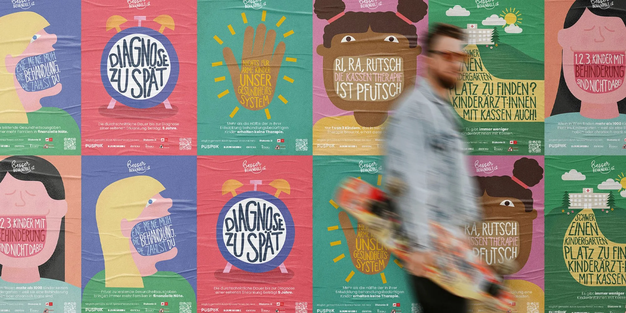
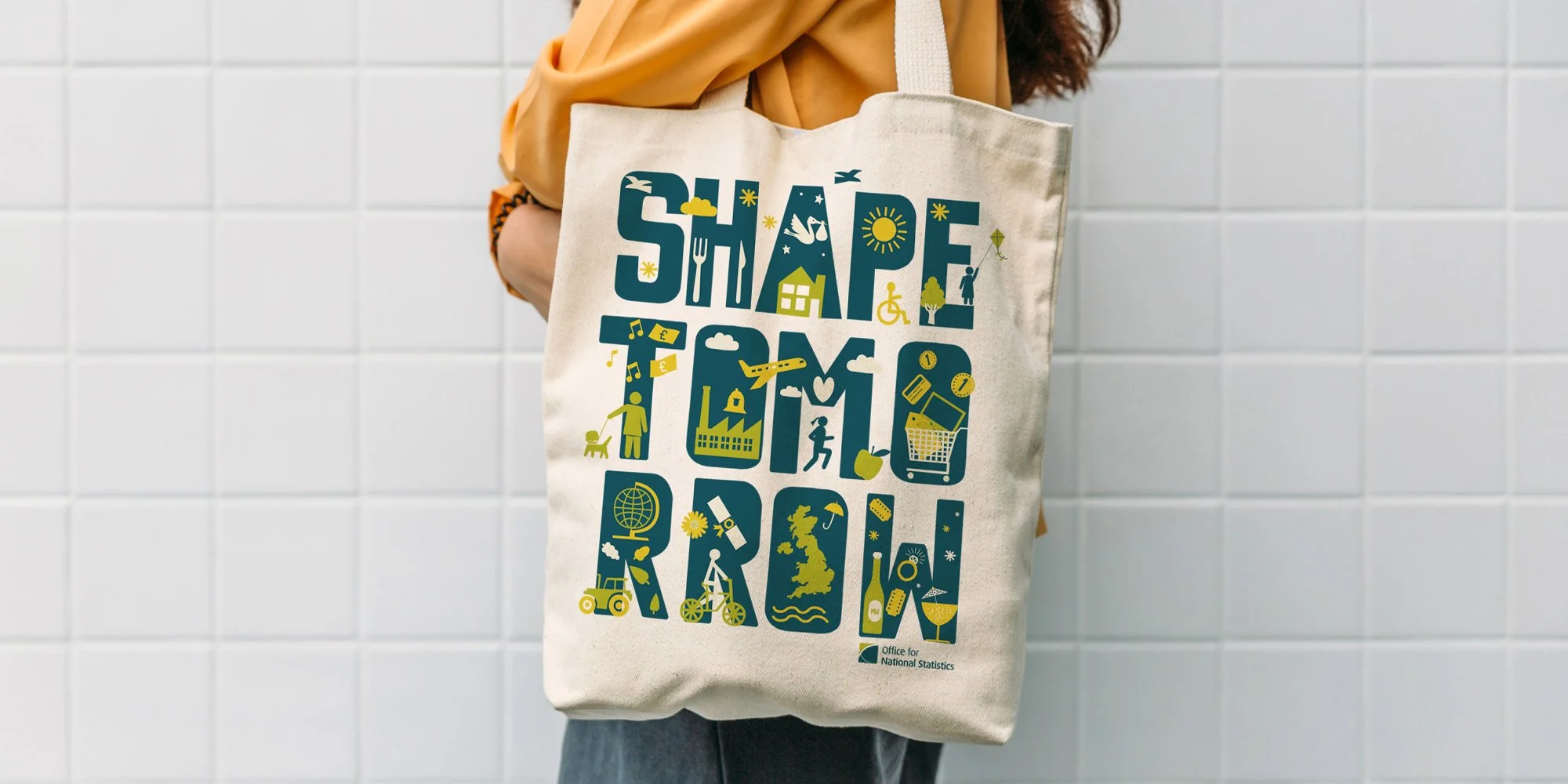
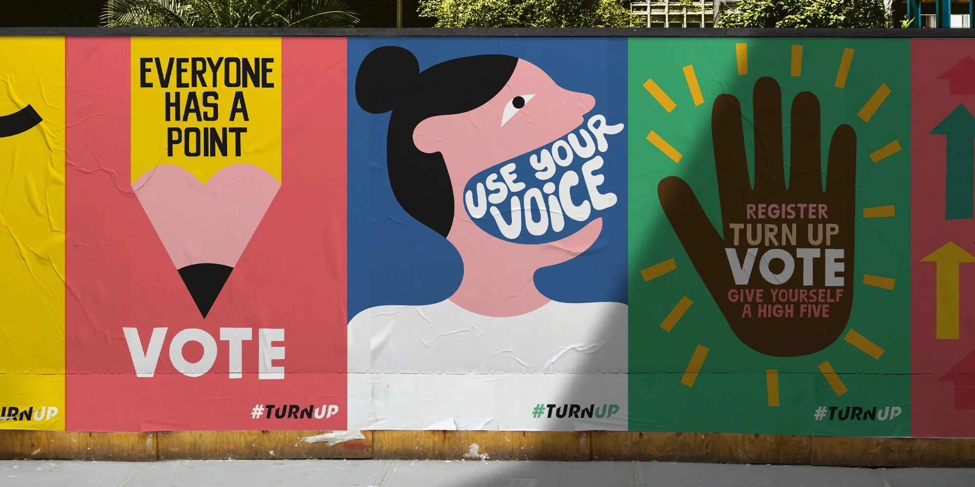
A collage of various everyday items including a man holding a t-shirt with a pink design, posters on a wall, children's snack packages, a framed art poster, a jar of chili jam, a sliced tomato and chili peppers on a cutting board, a person carrying a tote bag with text, clothing and accessories, and jars of honey.

Let's build something worth remembering.